My name is Alex Wong, and I’m a design intern at Content Creatures. I’m passionate about how design can bridge cultural divides and be used effectively for communication. I was born in Hong Kong and studied in the United States, starting my creative journey as a visual artist. However, when choosing my university degree, I decided on design because I was inspired by its powerful potential as an art form—how colour, typography, graphics, imagery, and thoughtful layouts can express emotions, identity, and tell compelling stories.
Graphic design has traditionally been dominated by Western influences, primarily due to the rise of consumerist culture in the West. But as mass communication technology spread globally, designers began to appreciate and recognise unique design styles from around the world.
In this blog, I’ll explore lesser-known design projects created within and for diverse cultural contexts. I’ll share what we can learn from these projects and discuss how they’ve personally inspired me.
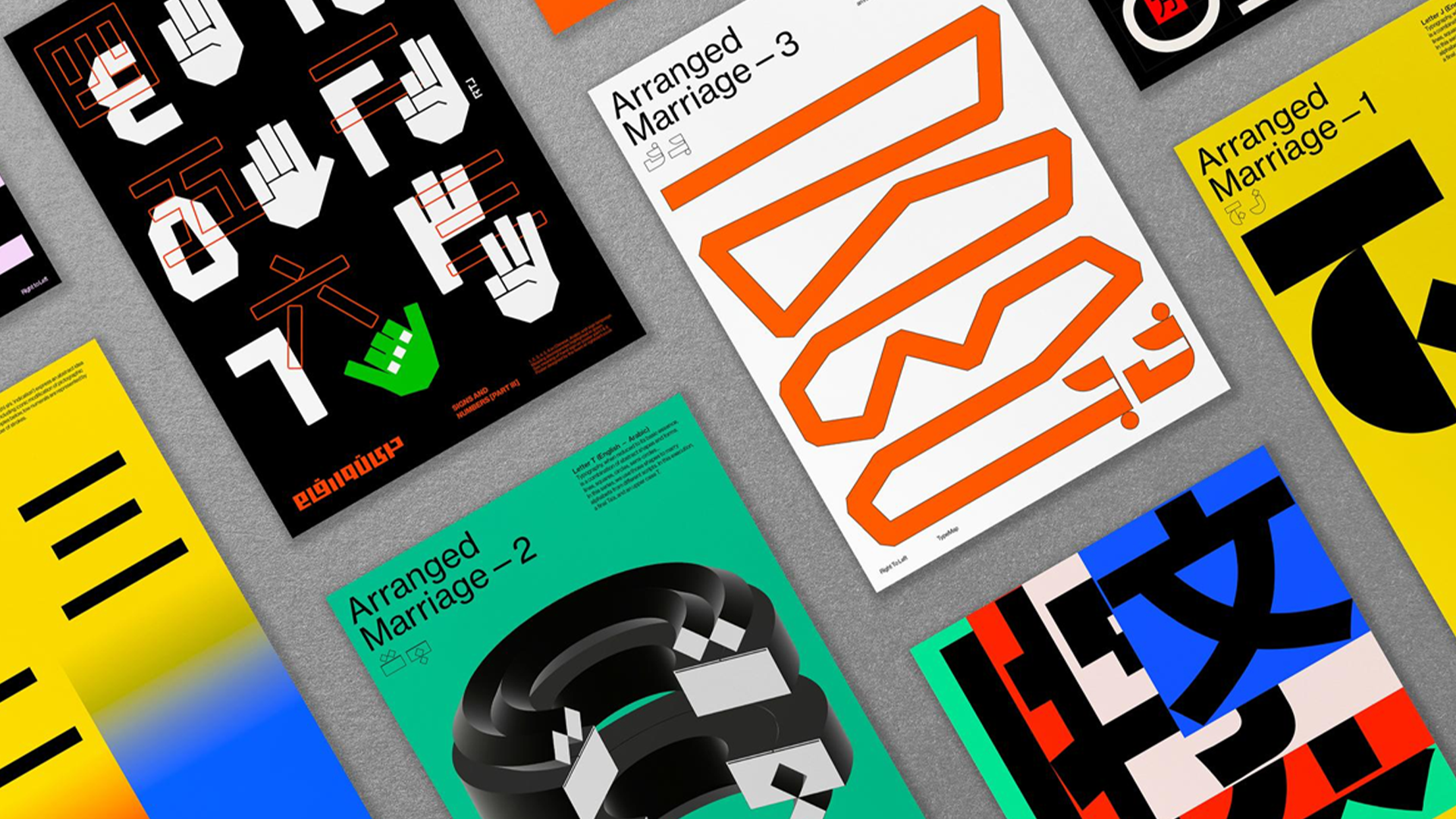
Project 1: Type Map
Type map is a design initiative that explores the relationship between typography, language, and culture.
Why was it created?
Developed by Right to Left, a multilingual design studio under the direction of Lebanese British designer Samar Maakaroun, the project was created to compare different scripts from different countries and encourage conversations about how typography shapes communication.
What does it do?
Type Map examines the structure, rules, and design principles of various writing systems, fostering a deeper understanding of how language and design intersect across cultures. It achieves this by presenting the pages of detailed script examinations, explaining their meanings graphically in compelling designs.
Why these stand out to me?
This project stands out to me because of its effective visual combination of languages and graphics. It manages to explain the intricacies and meanings of scripts in a visual way that anyone from any culture can understand. Having grown up learning about the Chinese language and script, I have been fascinated by the visual symbolism Chinese characters hold. Thus, It is particularly gratifying for me to not only see my language being graphically explained here, but it also taught me the scripts of other countries, their own unique pictorial qualities and visual symbolisms as well.
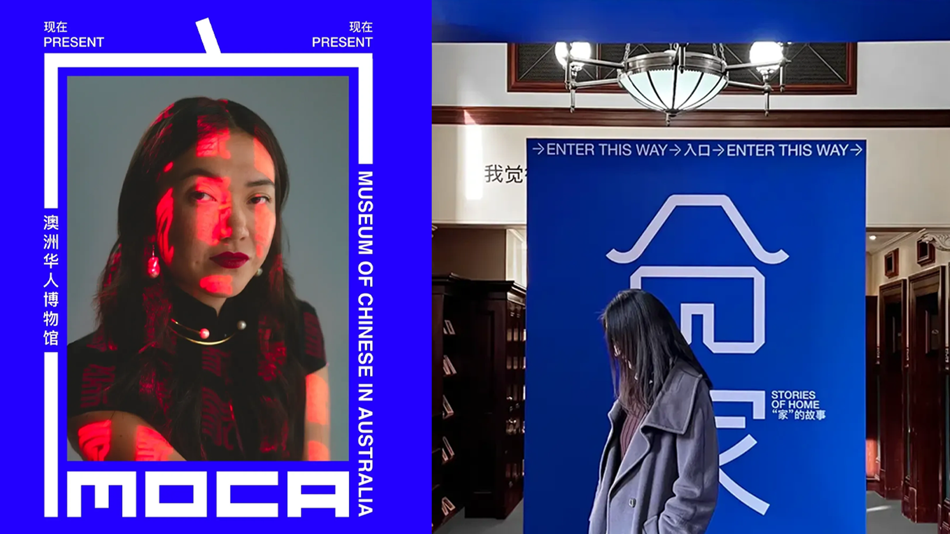
Project 2: Museum of Chinese in Australia
This is a brand identity project created for the Museum of Chinese in Australia, designed with a goal to reflect the essence of modern Chinese visual culture.
Why was it created?
The museum showcases the stories of Chinese immigrants in Australia, with the purpose of bridging cultural understanding between locals and the Chinese community at large. The brand identity designed by RG/A aims to visually represent Chinese culture in a modern, innovative way that is also culturally aware.
What does it do?
The brand identity takes advantage of the symbolism of Chinese character combinations and gives it new meaning by making them into graphical elements, combining them with photography and using them in innovative ways. For example, the Chinese character for ‘home’ (家) has the symbol of a roof at its top, symbolizing security. RG/A chose to use the ‘roof’ symbol as a visual representation of its meaning, appearing on posters as a literal roof over people’s heads, symbolizing their sense of home in Australia and China.
Why these stand out to me?
This project stands out to me because of its minimalistic use of bright colours, and for its creative use of Chinese characters as a visual method of graphical communication. As an overseas Chinese person, I often struggle to find my place in this new world. The visual identity of this project perfectly embodies my sense of identity and my search for a home.
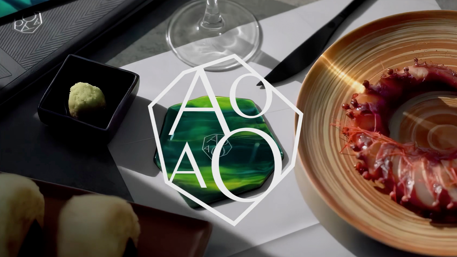
Project 3: AOAO
This is a rebrand project for AOAO, a Japanese rooftop restaurant and bar located in Central Hong Kong.
Why was it created?
This visual strategy, developed by famed Hong Kongese graphic designer
Toby Ng, was created in order to reflect its name: AOAO. The term is a Japanese euphemism for ‘lush green’, in reference the green gemstone that features prominently in the restaurant’s decor and cutleries.
What does it do?
A gemstone is usually hidden inside a rock, with the outer shell needing to be cracked in order to reach the gem. So as shown in the presentation video, the brand identity embodied in its logo is intended to shape like a rock holding a gemstone inside, as if it’s waiting to be cracked opened and discovered. This creatively symbolises the restaurant itself as a hidden gem, waiting to be discovered by its customers.
Why these stand out to me?
This project stands out to me because of its visual storytelling. As a designer I am endlessly learning about new ways every minute detail in a visual identity can reveal a story. The logo’s clever use of shape and representation of its brand story teaches me a new way this can be done. It not only creates a powerful and symbolic brand identity but is also distinctively Japanese in its minimalism and feeling that I really like.
Project 4: KAMIZU
Kamizu is a series of illustrated character designs that appears on merchandise and deliverables.
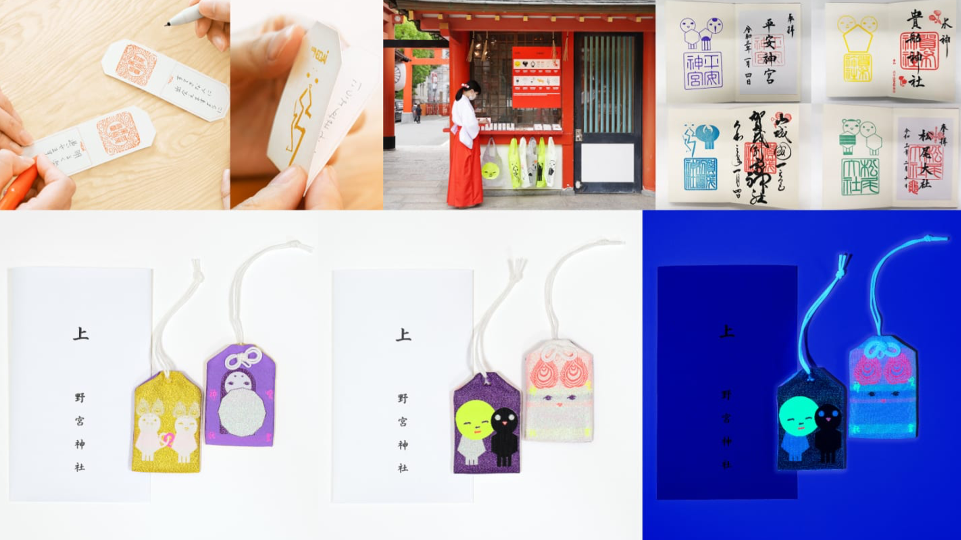
Why was it created?
Designed by the award winning Japanese graphic designer Kazunari Kitagawa, the Kamizu characters takes inspiration from the Shinto religion. Shinto believes every object in the world is inhabited by living gods called the Kami. And as stated in their website, the Kamizu is an alternative interpretation of this belief, said to be secret spiritual guardians watching over good people who are struggling. In a place where there is a rich heart, the Kamizu looks after you.
What does it do?
In collaboration with Shinto Shrines and distributors in Kyoto, Kobe and Tokyo, the illustrated Kamizu characters are designed onto bags, phone tags and other deliverables. They are intended to be gifted to someone in your life that has a good heart but needs guidance.
Why these stand out to me?
This project stands out to me because of its concept and its creative reimagining of Japanese beliefs. I am aware of the various beliefs of eastern folk religions we hold. Even as times passed there is still something communal about our cultural beliefs that brings us together. This project is inspiring not only because of its striking use of colour and clever character design, but also for its use of cultural beliefs as a mechanism for community.
Project 5: SHARJA
This is a brand identity created for Sharjah, one of the seven United Arab Emirates.
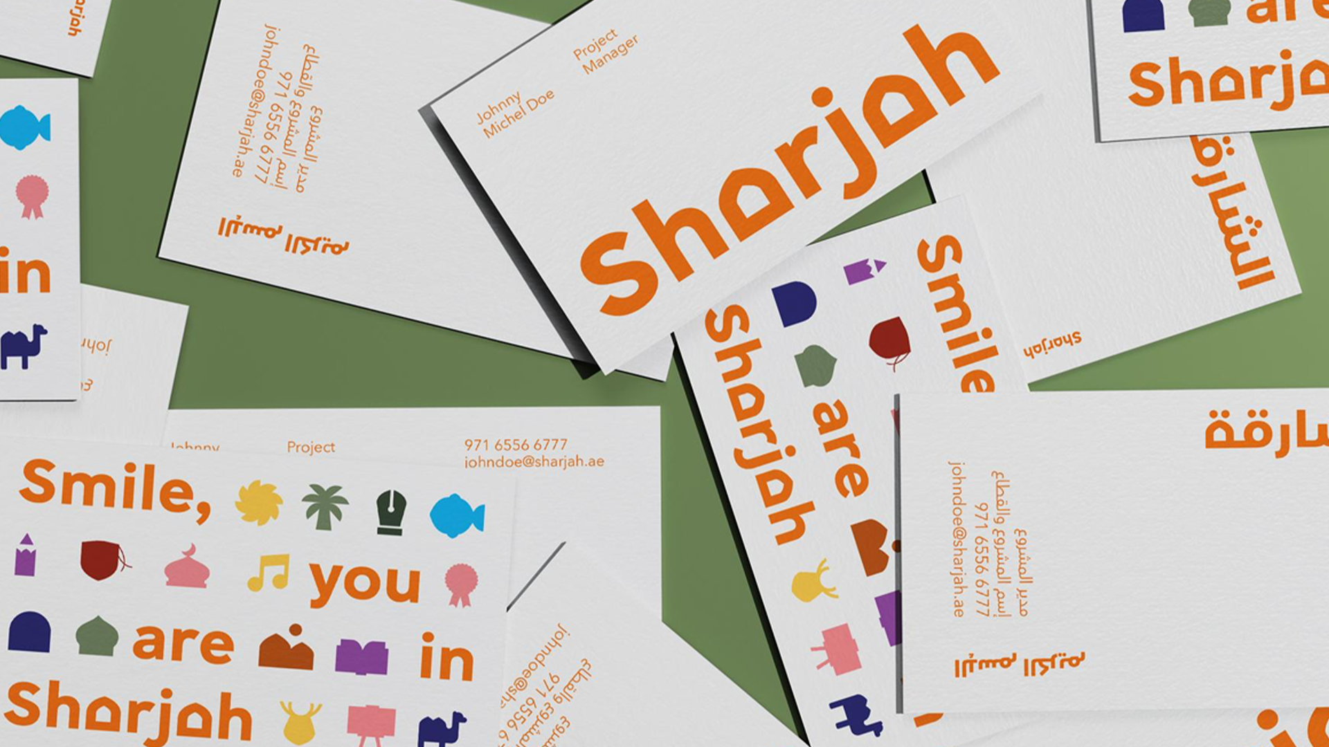
Why was it created?
Designed by Pentagram under the direction of Samar Maakaroun, it was created to reflect Sharjah’s rich cultural heritage, as well as projecting the image of a modern city with a vibrant arts and culture scene, ideal to work, live and invest in.
What does it do?
The strategy, as stated by Maakaroun herself, is achieved by incorporating features of Emirati architecture, predominately the arch. The arch is not only an instantly recognisable feature in Islamic architecture but also symbolises structural integrity. Using the arch to replace the A’s of the logo name embodies a pathway, progress and a journey forward.
Why these stand out to me?
This project stands out to me because of its clever integration of architecture into its brand identity. As a designer I am always looking for new ways to visually represent a culture, and this project taught me architecture as an avenue not only because of its cultural significance, but also for its various hidden meanings and metaphors.
Inspiration Across Cultures
As designers, it’s important not to limit ourselves only to the design styles and visual communication methods familiar to us. Instead, we should actively explore and learn from other countries and cultures.
Every country has its own unique approach to design, shaped by its culture, traditions, social norms, and visual influences. By studying designs from different cultures, we can discover fresh ideas, new aesthetics, and innovative storytelling techniques.
Incorporating these insights into your own design practice can help you create something truly original, allowing you to present exciting, new perspectives to the world.
Want to learn more about us?
Feel free to explore our previous work and discover our studio capabilities!